Floral Interior Design with Little Greene
The kids are back to school, so at Freddie’s, we thought we could add a few bits to your curriculum too. This September, we’re bringing you so much more than just flowers – we’re talking to experts at some of our favourite brands. Sharing some floral interior design, colour theory, wellness and gardening secrets with you! Keep up with our socials and blog to learn some tricks of the trade for perfecting your home and heart.
First up, we chatted to our friend Ruth Mottershead, Creative Director at Little Greene about colour! These home decor experts know a thing or two about how different shades can make you feel, and how you can perfectly pair flowers with your space!
What are you all about at Little Greene? What inspires you?
“At Little Greene, our paint colours are steeped in history. Our dedicated research team works continuously behind the scenes to find the most beautiful historic paint colours and wallpaper designs which we recreate for the contemporary interior.”
You have collections of floral wallpaper, and a few shades of paint named after and inspired by flowers, but how do you go about deciding what shades or flowers to feature?
“Our wallpaper collections are all drawn from history, including our floral wallpaper designs. We work with the National Trust to recreate historic wallpaper designs from original patterns found in a range of National Trust properties. We rework the historic patterns to make them more suited to the contemporary home, then create different colourways using shades from our palette.


Briar Rose – Green Stone (c.1845–1915)
Ceiling: Green Stone - Pale 268
Wall and Upper Panelling: Green Stone - Pale 268
Lower Panelling, Dado and Skirting: Green Stone - Light 269
Kitchen Units: Book Room Green 322
Through this research, we have uncovered a range of beautiful floral designs that have become firm favourites. From our latest collection, National Trust Papers III, there is the Arts and Crafts style ‘Briar Rose’, which began its life as the background to a wallpaper called ‘The Sleeping Beauty’, featuring characters from the fairytale among the roses. This collection also includes ‘Bird & Bluebell’, an elegant mural which was created from fragments of wallpaper found at Felbrigg Hall in Norfolk.

Bird and Bluebell – Pea Green (c.1830 – 1870)
Ceiling: Dorchester Pink 213
Window Frame: Green Stone - Light 269
Skirting: Puck 298
One of our most popular wallpapers is ‘Hencroft’ from the first National Trust Papers collection. This design was a stitched, repeating pattern of stylised cowslips found at Wardle’s school of embroidery in Leek, now effortlessly translated into a wallpaper design in eight stunning colourways.”


Hencroft – Punch (c.1890)
Ceiling: Slaked Lime 105
Lower Wall and Skirting, Jewel Beetle 303
Door in Slaked Lime – Mid 149
How would you go about choosing a paint colour for a space, where do you start?
“It is always important to consider the function and orientation of each room in the house when choosing colour. Creating continuity means thinking about how a space is used in order to create a versatile palette with longevity. Focus on choosing specific colours for the atmosphere you wish to create in a room rather than current trends, then relate these tones subtly from room to room.
Choosing colours for any decorating project is also dependent on direction of light, proportions of the room, the architecture within the space as well as ceiling heights and the consideration of existing furniture and soft furnishings. You can find lots of helpful guidance on how to choose colours for different rooms in the advice section of our website.”

Ceiling: Julie’s Dream 26
Left Wall: Masquerade – Mid 333
Right Wall: Masquerade 334
Panelling: Masquerade – Light
Do you find that different colours evoke certain emotions or moods?
“The colours you choose to surround yourself with are key to determining how the space will make you feel. Very often we feel the effects of colour even when it is used as a backdrop to support other textiles, accessories and design pieces.
More than ever, there is a greater need to surround ourselves with comforting, soothing colours that are not only easy to live with but provide warmth and serenity within our living environments. Our soft pink ‘Masquerade’ is the perfect colour for bringing warmth to a space whilst making us feel uplifted and calm, whilst greens like ‘Sage Green’ or ‘Aquamarine’ are a wonderful choice for a balance of tranquillity and optimism.

Ceiling: Giallo 337
Walls: Giallo 337
Cupboard: Giallo 337
Left Wall: Bone China Blue – Faint 325
Colours with a blue tone such as ‘Loft White’ and ‘Dock Blue’ are a great choice for home offices, improving focus and concentration. Whilst yellows such as ‘Giallo’ or ‘Indian Yellow’ work particularly well for lifting the mood and increasing energy in a space. They are well suited to cheerful, busy spaces such as kitchens, creating a sense of warmth and happiness when you’re having your first cup of coffee, helping you feel motivated to start the day.
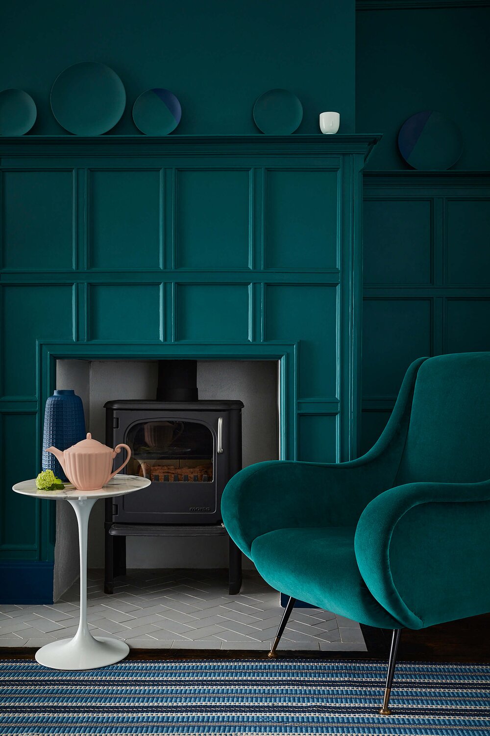
Don’t discount dark colours; you can create a cosy, intimate interior with intense cocooning colours such as ‘Mid Azure Green’ with ‘Royal Navy’ skirting. Deep greens like ‘Puck’ or ‘Jewel Beetle’ will create a truly sumptuous finish when paired with woodwork in ‘Chocolate Colour’.”

Wall: Jewel Beetle 303
Dresser: Chocolate Colour 124
Ceiling: Pique 299
What is your favourite shade or wallpaper, and what flowers would you choose to complement the interior design?
“It changes all the time, but one of my favourite shades at the moment is ‘Garden’, a beautiful mid-strength green that brings a fresh ambience of midsummer itself.
The true colour of nature, green is a wonderful backdrop for floral arrangements. Its neutral makeup means it is a versatile tone that pairs well with many different colours, but pink and green is a classic, natural combination that is easy on the eye and provides a level of gentleness and tranquillity. You could choose something soft and elegant such as pale pink peonies, or go for something a little bolder like an arrangement of bright magenta, red and orange roses, to create a really vibrant scheme.”

Ceiling: Slaked Lime - Mid 149
Walls: Re:mix Sage Green 80
Stay tuned to hear from our pasta-loving pals next week!

Up next...
Your ultimate guide to peony care
Peony season has well and truly arrived and already we don't want it to end. Make the most of your peonies with these easy care tips.
From fresh bud to long-lasting bloom
Our flowers are the freshest around, arriving in bud and opening to their full beauty at your home. Find out how you can make the most of your arrangement to enjoy it for up to two weeks or longer.